


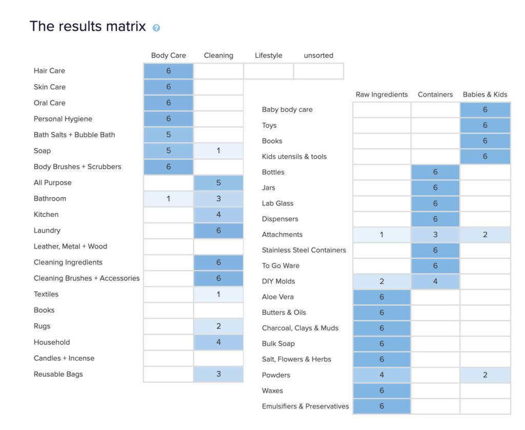
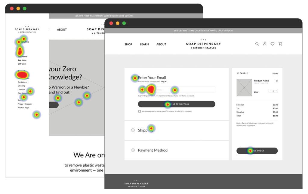
Seamless Navigation: The current navigation is overwhelming and makes it hard to locate products. The solution uses progressive disclosure to reduce cognitive overload and create a seamless experience.

Seamless Navigation: Robust filtering and search options on the shop page provide a better user experience. Their current site does not offer this additional search functionality.

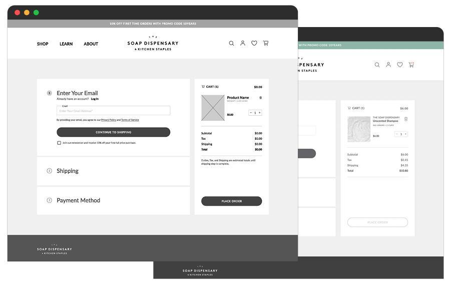
Affordability: The creation of custom kits that allow customers to trial products at more affordable rates are showcased. Currently the only cost incentive they have is in the promo banner with 10% off first orders.

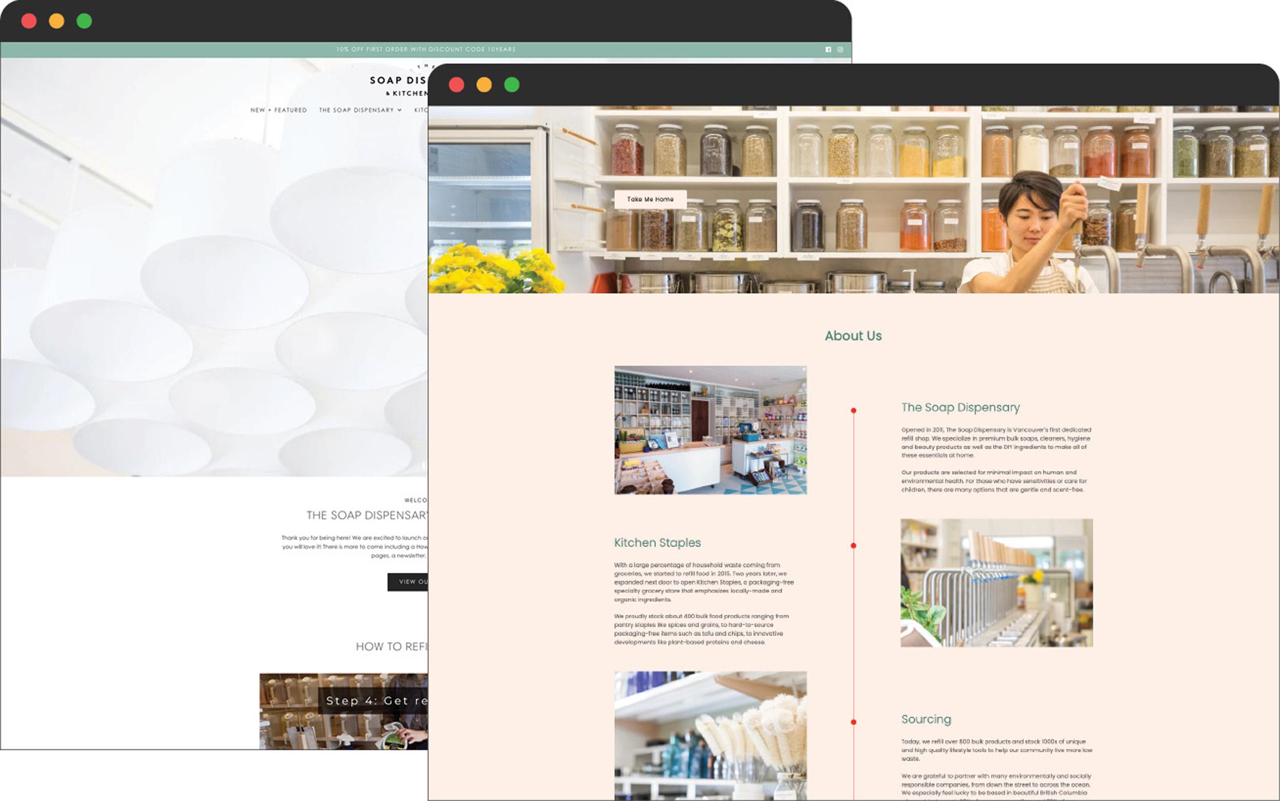
Convenience: Provides clear instructions on how to shop in-store and online. This is currently located in a video and only offers information for shopping in-store.

Education: Highlights zero waste and its importance is essential for customers to understand the benefits of shopping at The Soap Dispensary. They currently don’t provide this content.

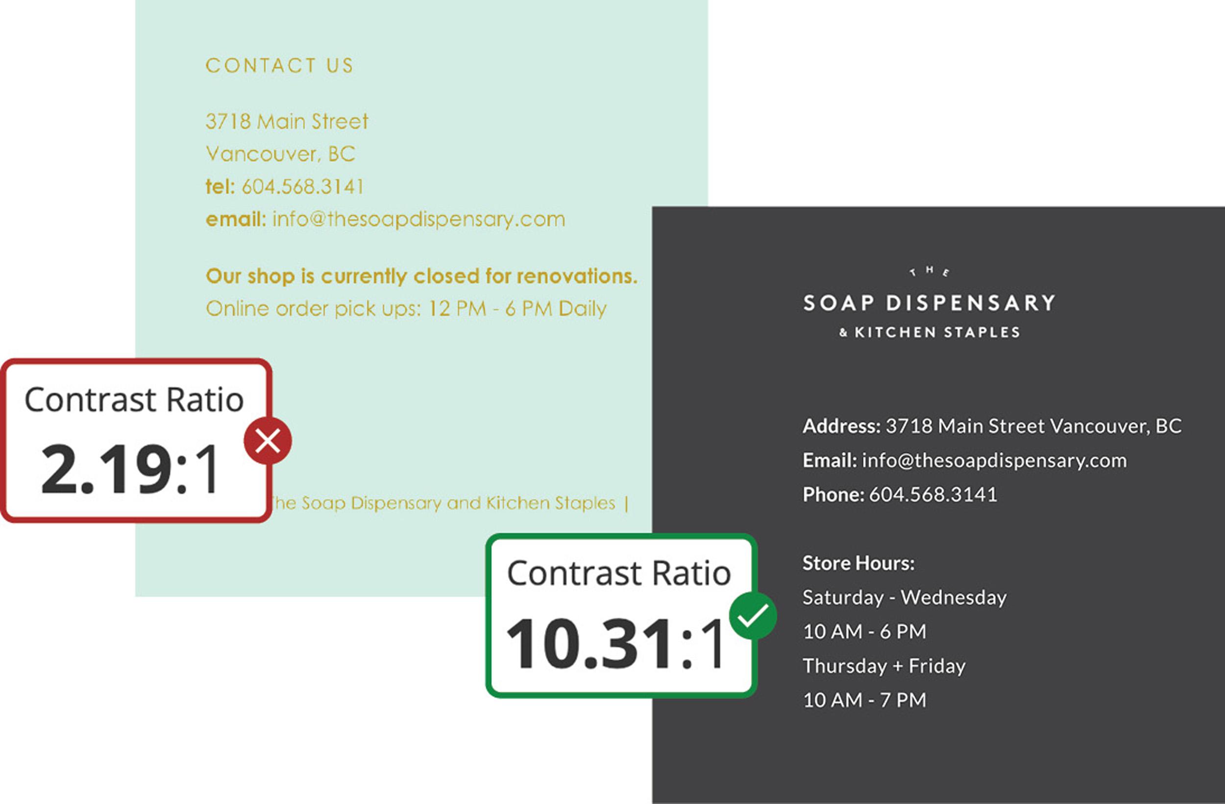
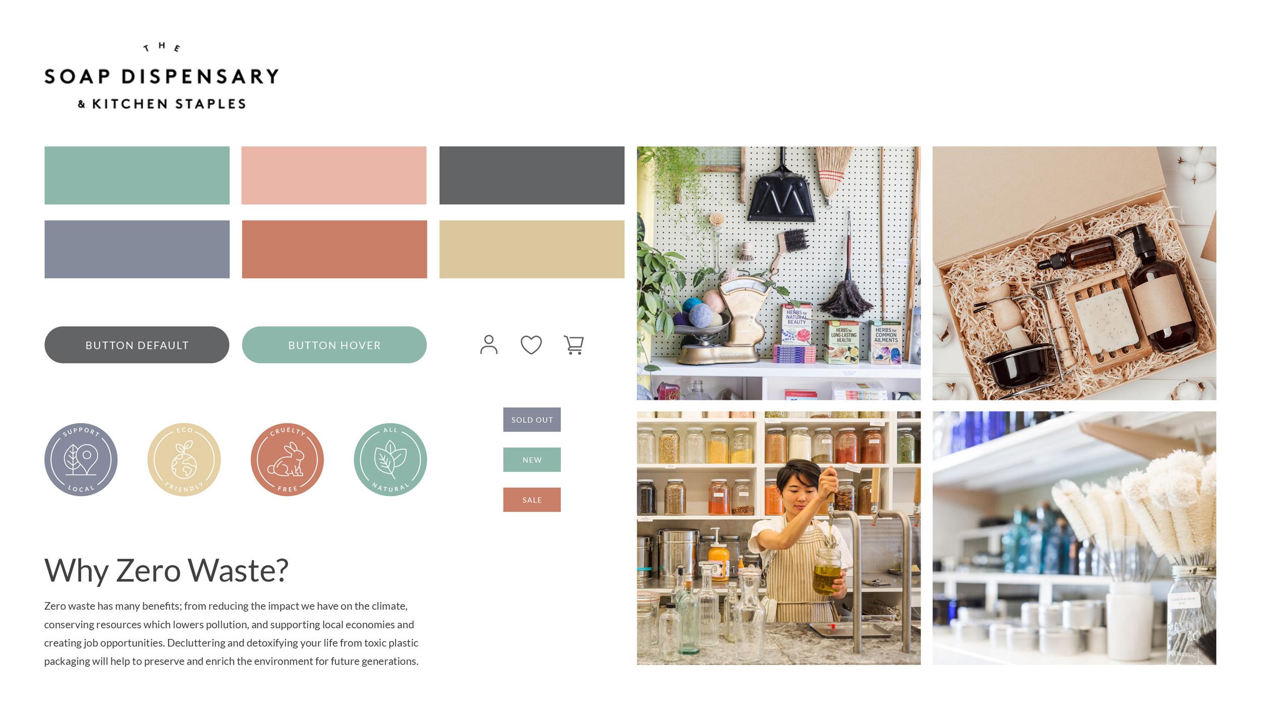
Trust: Achieved through consistent visual design combined with an inviting and encouraging written tone. Currently their site feels disjointed with inconsistent visual design and user experience.