Clario
An app to support those living with inflammatory bowel disease
- Project: App Design Concept
- Roles: UX Researcher/Designer, UI Designer
- Duration: 4 weeks
- Design Toolkit
About
Clario is an app concept to support those living with Inflammatory Bowel Disease (IBD), a condition that impacts the gastrointestinal tract. The purpose of the project is to create a tool that will help people better manage their IBD to improve their overall wellbeing.
Discover
Introduction
Canada has one of the highest rates of IBD in the world, with an estimated 300,000 Canadians living with the disease. Trying to juggle everything that goes along with a chronic illness can be hard. Clario aims to provide people with a way to help manage their condition and reduce unnecessary stress and frustration.
Initial Assumptions
- Individuals with IBD can feel overwhelmed with everything they need to manage
- Information is kept in multiple places making it difficult to keep track and manage aspects of their disease
- A lack of understanding of their condition and what impacts it creates frustration
It’s hypothesised from these assumptions that what individuals need is one easy-to-use place that brings all aspects of IBD management together — providing a more holistic view that enables them to more effectively manage their health and improve their wellbeing, the following research looks to uncover opportunities to provide this.
Competitor Research
To understand the competitive landscape, similar apps were reviewed to understand how they present themselves in the market and what features they offer.
Through this review some common themes were identified:
- Felt clinical in their language and visuals
- Included too many features making things overly complicated
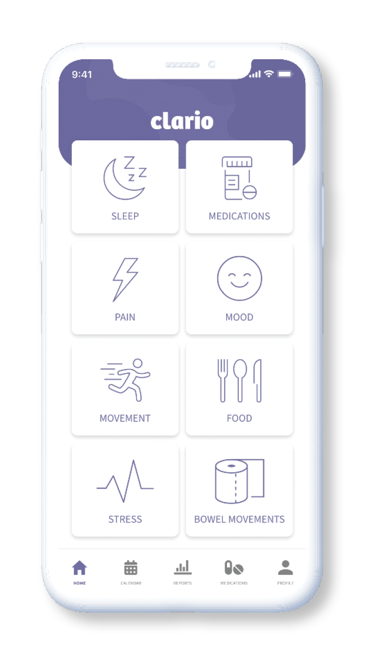
- Only tracked specific things and not all aspects that may impact those living with IBD
DEFINE
Survey Insights
A survey was used to gain insights into what would help people with IBD better manage their condition and identify key frustrations. This survey targeted people with IBD aged 20-60.
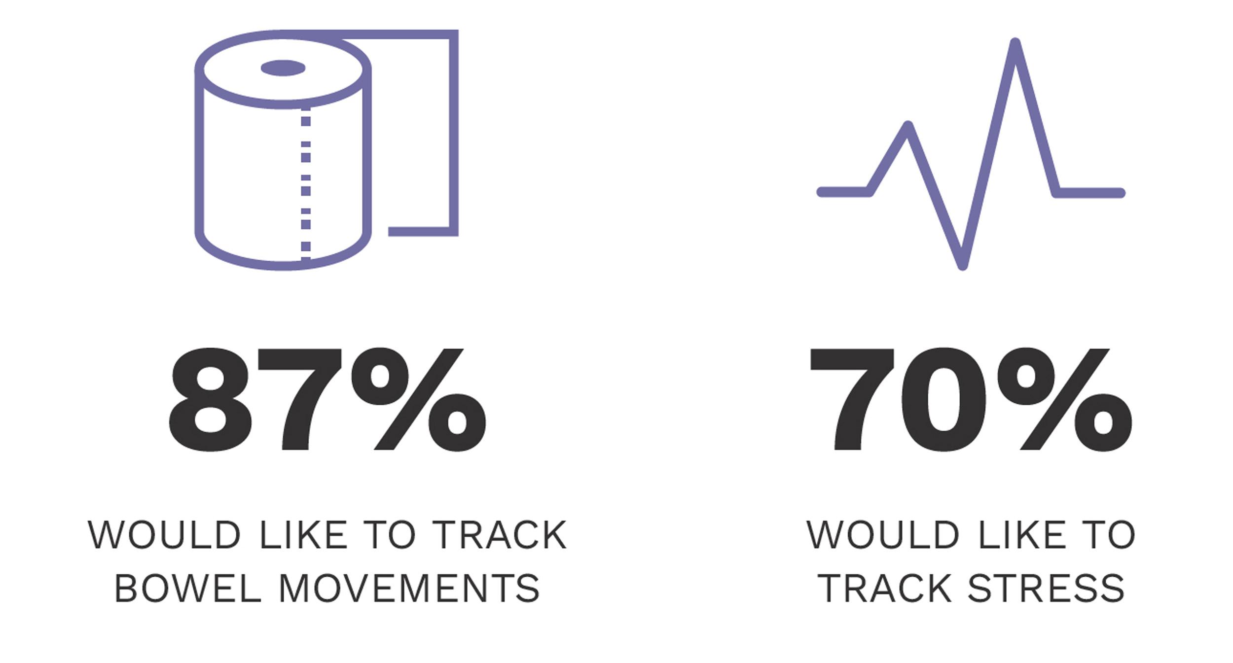
87% of respondents noted mental health to be the top struggle they face. People wanted data and insights on key factors that impact IBD. These include: food, stress and medications. People felt that by monitoring these factors, they would be better able to manage their condition and improve their overall wellbeing.
“Understanding what causes my symptoms to flare up would help me prevent it”
“My Crohn's management is a work in progress, and the more I learn about what works for me and for others, the better things might be.”
Research + Design Opportunities
Beyond the survey, research was done to help define the direction and design opportunities through:
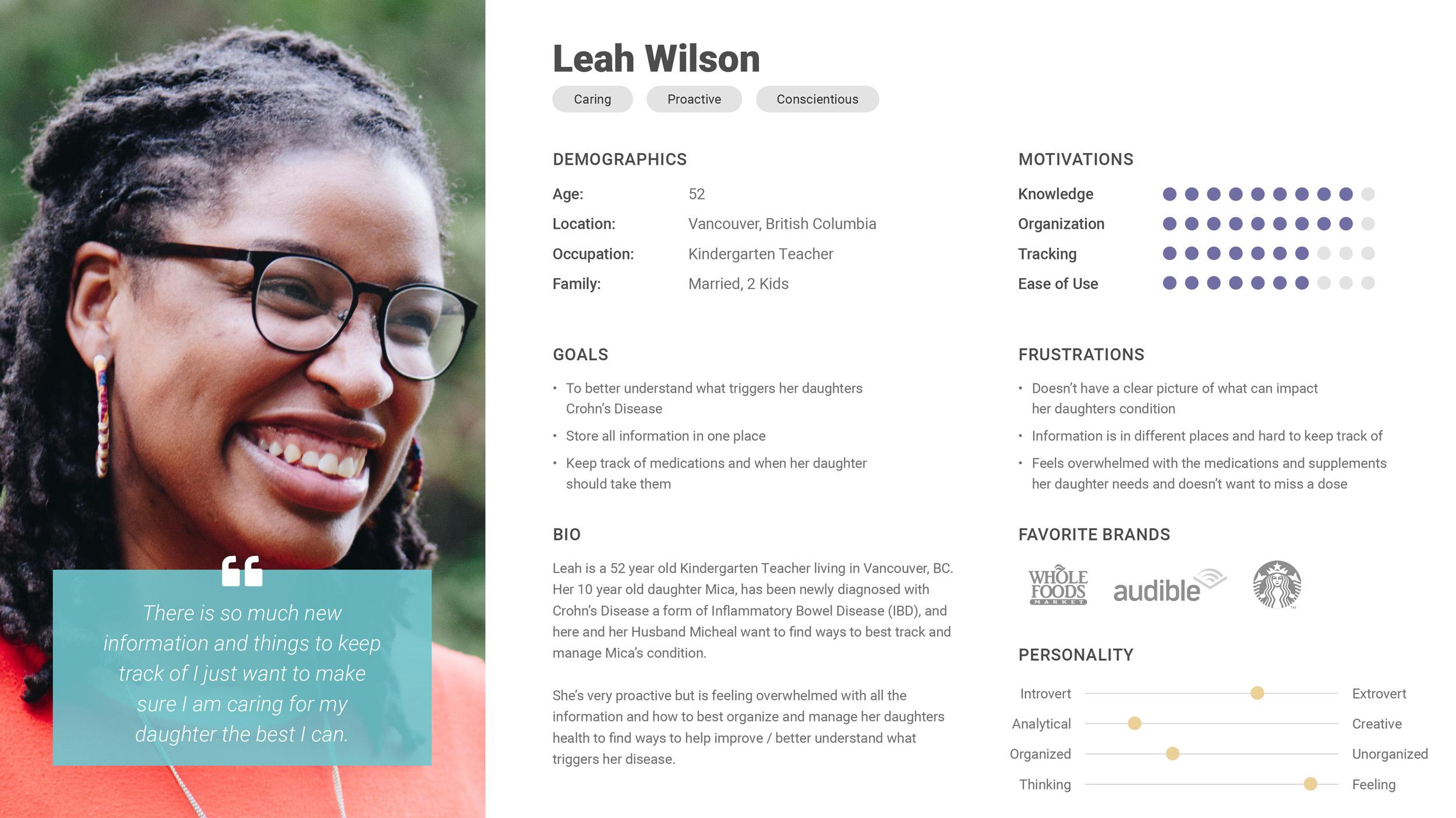
- Proto personas to start crafting a picture of who would be using the product
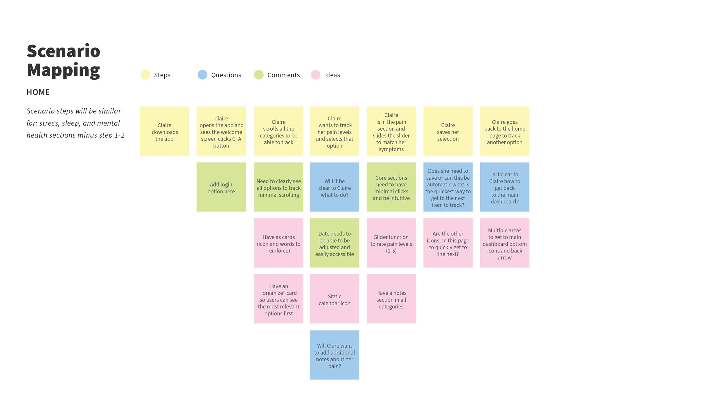
- Scenario mapping to explore how people would complete specific tasks
- Product requirements to start organising what features and requirements may be needed to achieve user goals

Target Audience
Through analysing survey and research results: two target audiences were identified. These were important to define so the app development could be versatile and meet different use cases.
Primary Audience: Those newly diagnosed with IBD, or who have been living with the disease for some time and need a way to track and monitor their condition.
Secondary Audience: Parents of younger children with IBD, who need to understand what causes symptoms so they can manage triggers and best support their child's health.
Problem Statement
“How might we better support those living with IBD to better understand and feel in control of their condition?”
Goals
Three primary goals were established to support the defined problem statement before advancing to the develop stage of the process:
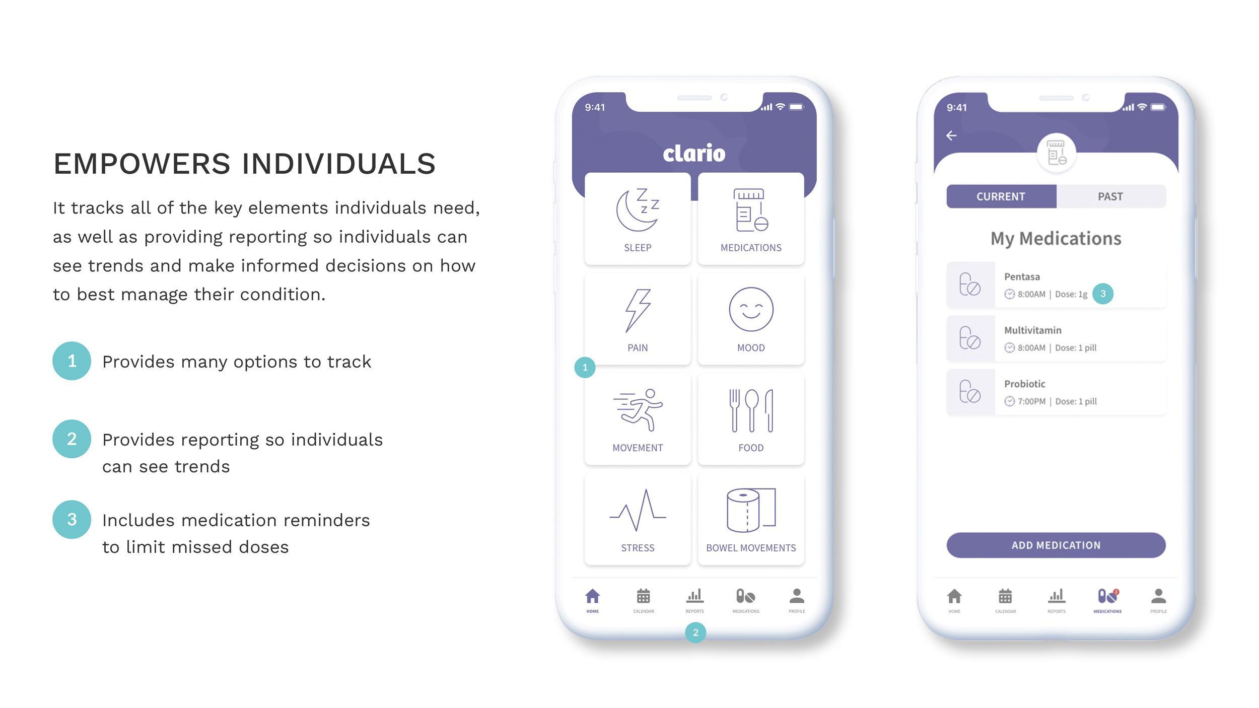
- Create a useful tool that empowers people to feel in control and find ways to manage and improve their condition. As was established in the survey there are many things that can impact a person’s IBD. Therefore, there needs to be a place to track a wide range of factors to see what may be improving or worsening their condition.
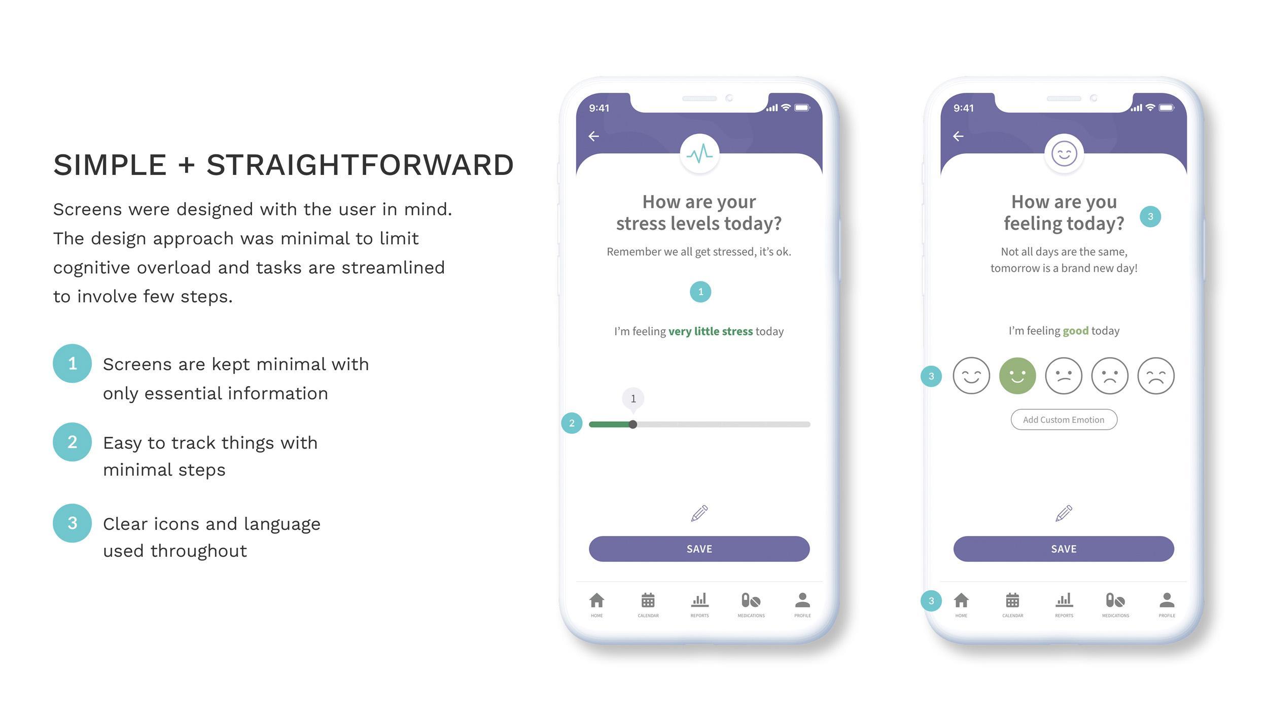
- Keep things simple and straightforward. The research made it clear that people with IBD may be overwhelmed, in pain or mentally exhausted. So, it’s important to make things simple to avoid unnecessary frustrations.
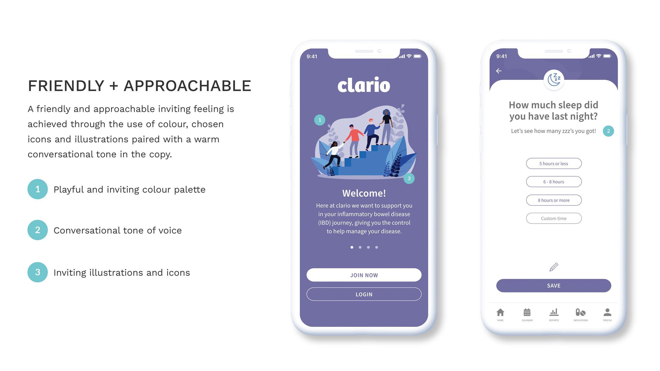
- Create an app that is friendly, and doesn’t feel clinical. Creating a product that feels approachable and supportive instils the feeling of empowerment and is beneficial in getting individuals to feel inclined to use the app and therefore benefit from it.
Develop
Wireframes
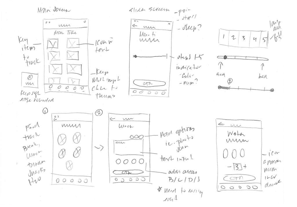
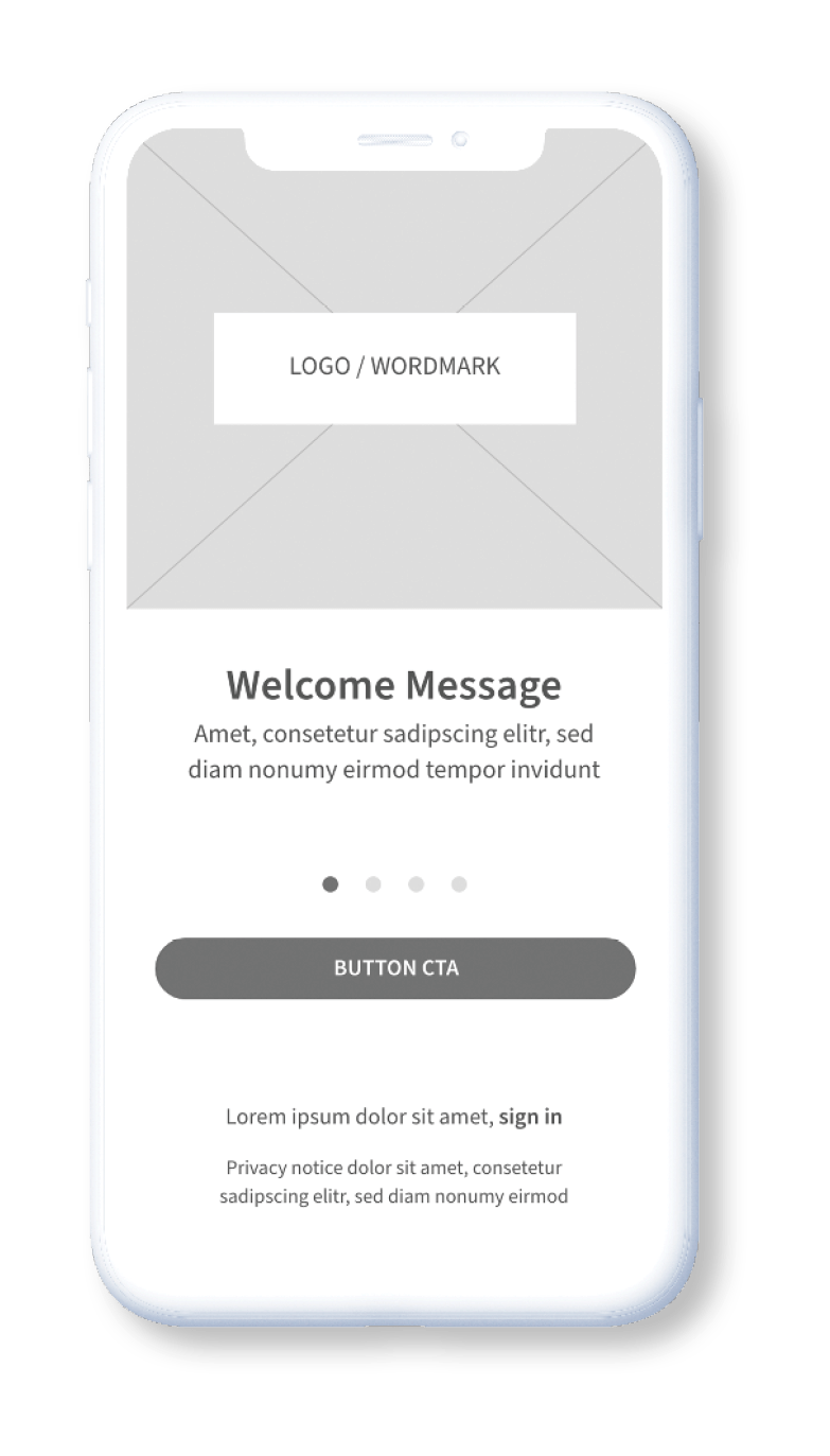
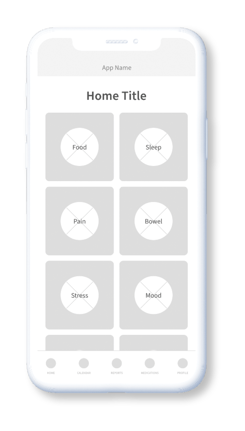
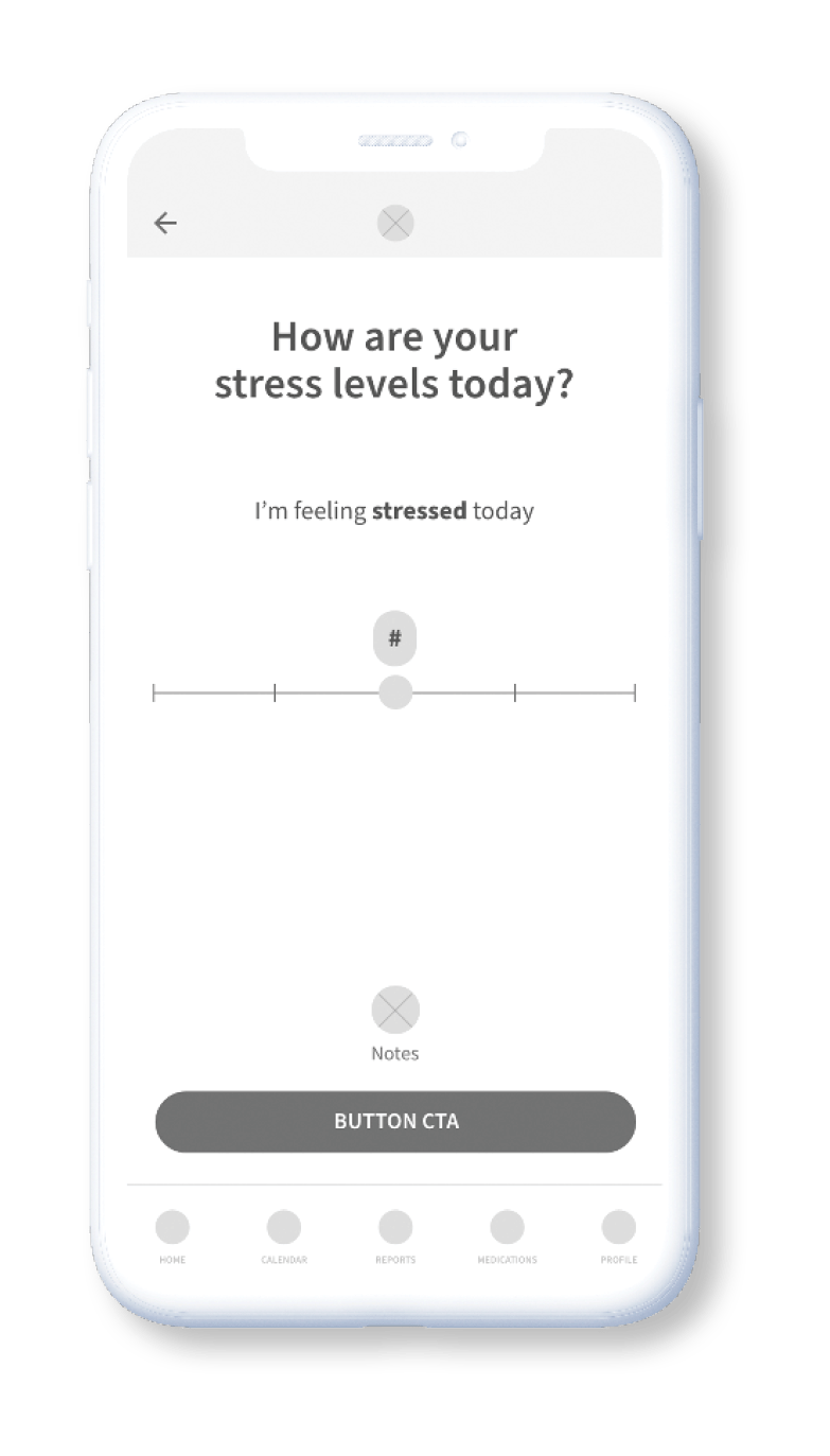
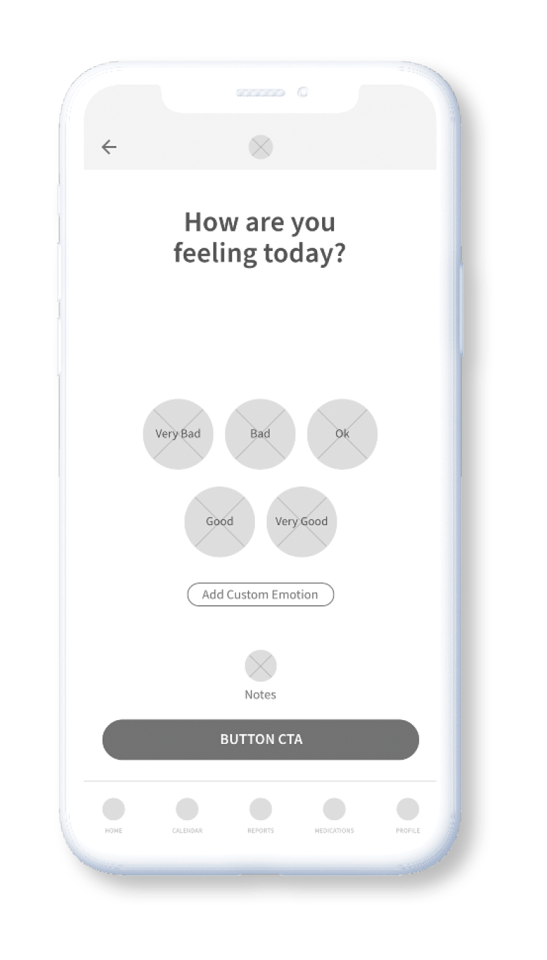
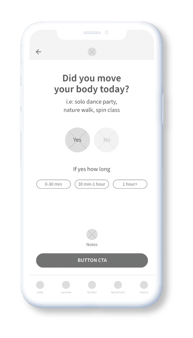
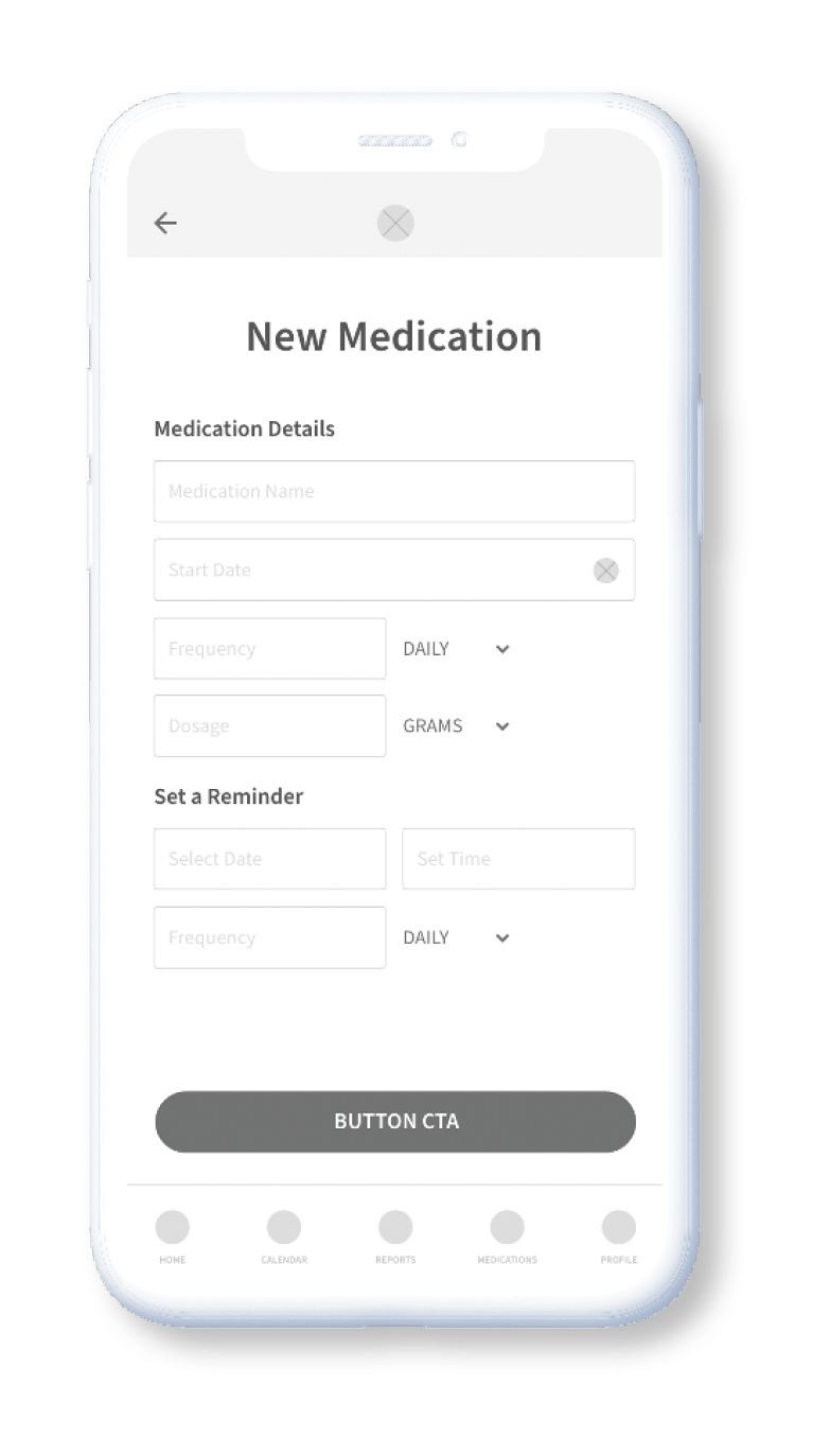
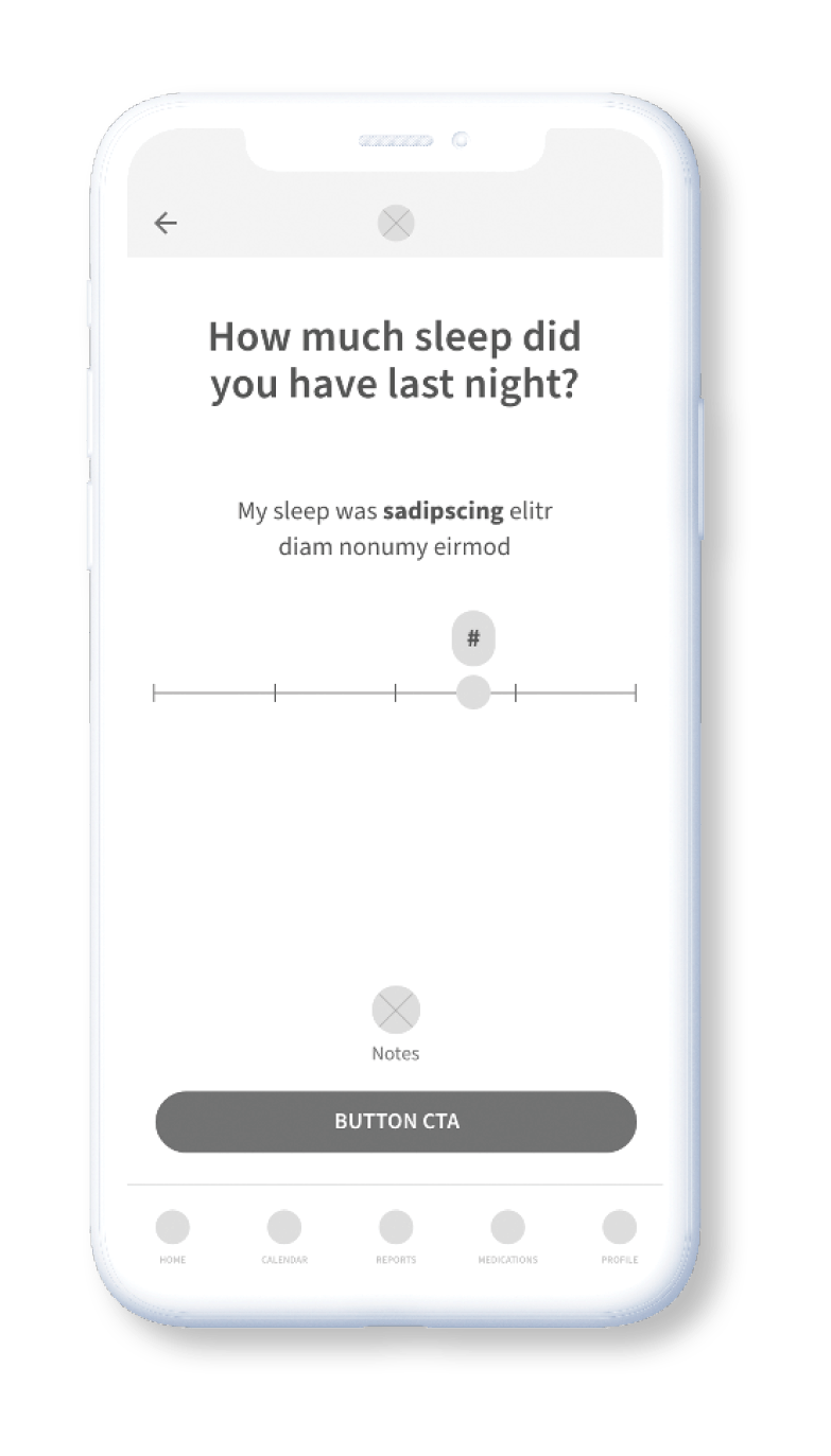
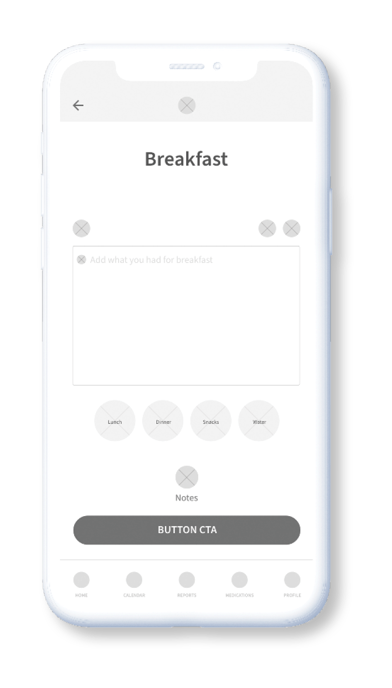
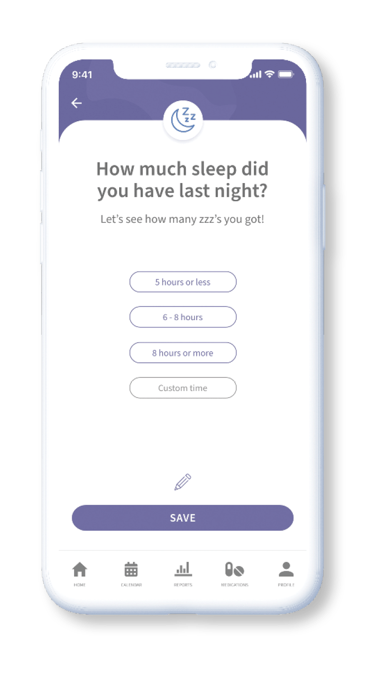
Sketches were done to quickly ideate the structure and the information architecture needed for the variety of screens. These were followed by low fidelity wireframes providing a more defined direction of how the interface would come together.
Usability Testing
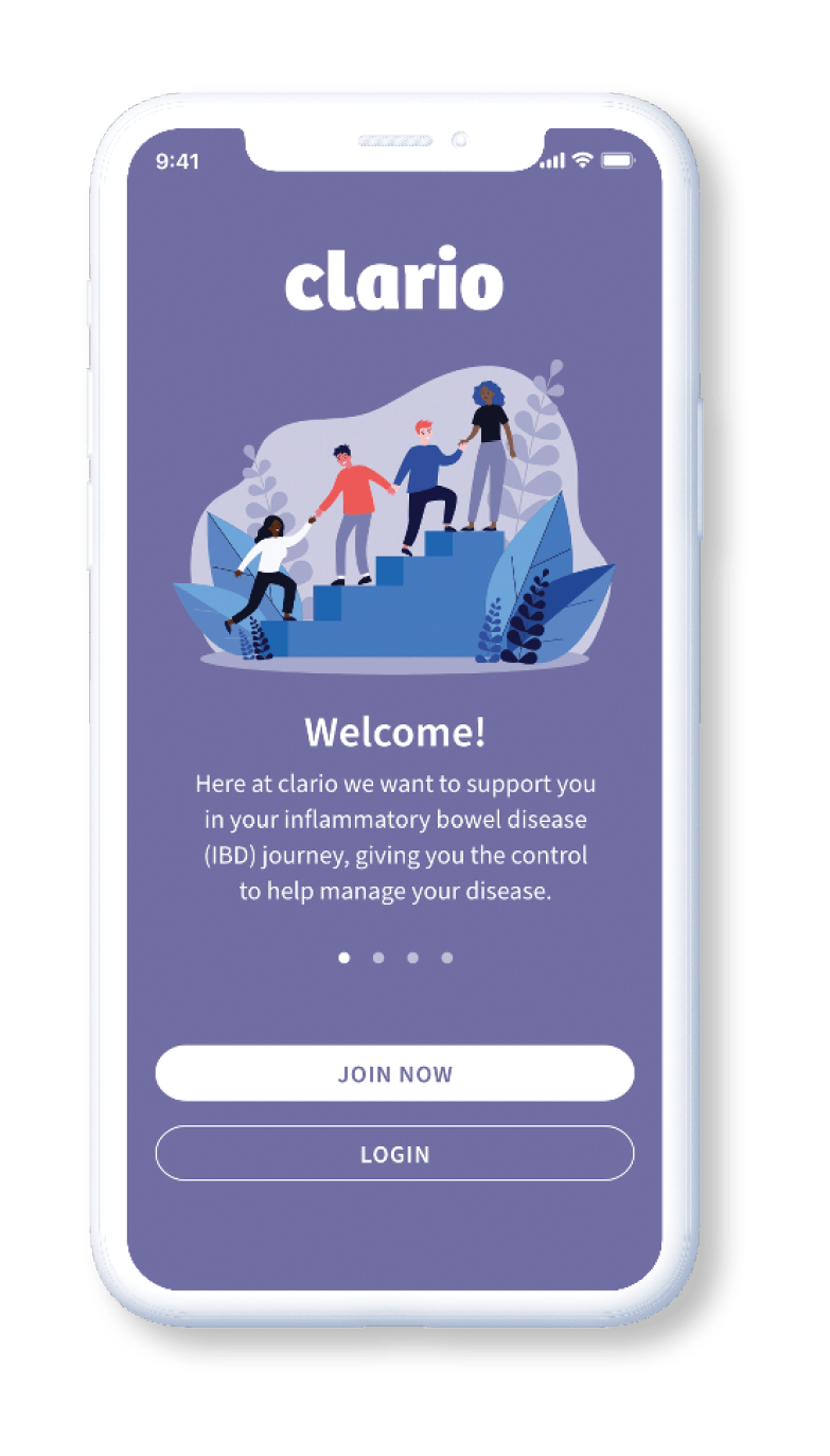
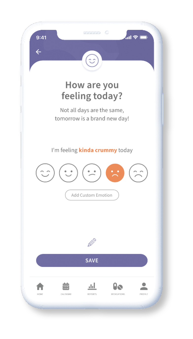
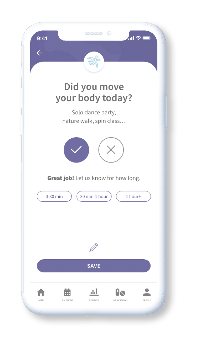
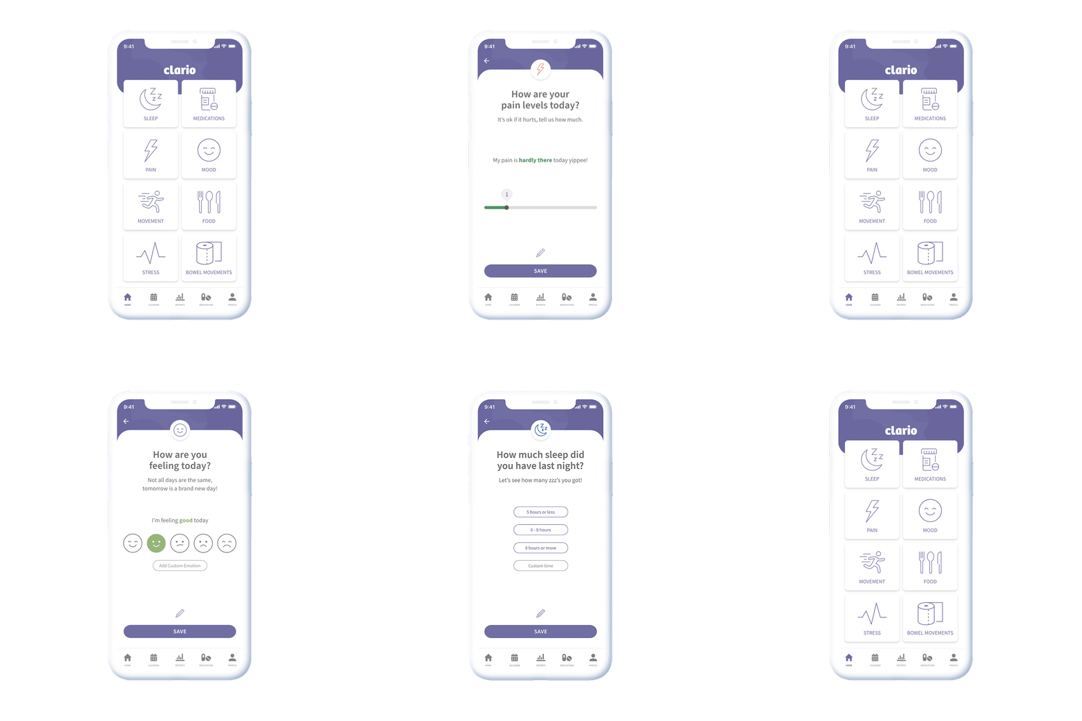
Five people completed user flow testing over Zoom. Each was given a variety of tasks to complete and asked to talk through their thought process while doing so. These tasks all began on the welcome screen before participants were asked to: track their pain, input what they had for breakfast, track their mood and add a note.
This form of testing is valuable — it mitigates the risk of the confusion that can happen with testing software, provides real time feedback and enables informative two-way conversations with users.
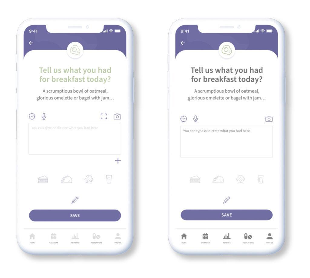
These tests were successful with all participants completing the given tasks. Feedback was largely positive. The process identified key improvement opportunities in the food tracking flow, as some icons were not clearly understood. To fix this, the screen was simplified and some unnecessary functionality removed to prevent confusion.
Deliver
Final Solution
The final user experience and visual design meets the primary goals in the following ways:
Accessibility
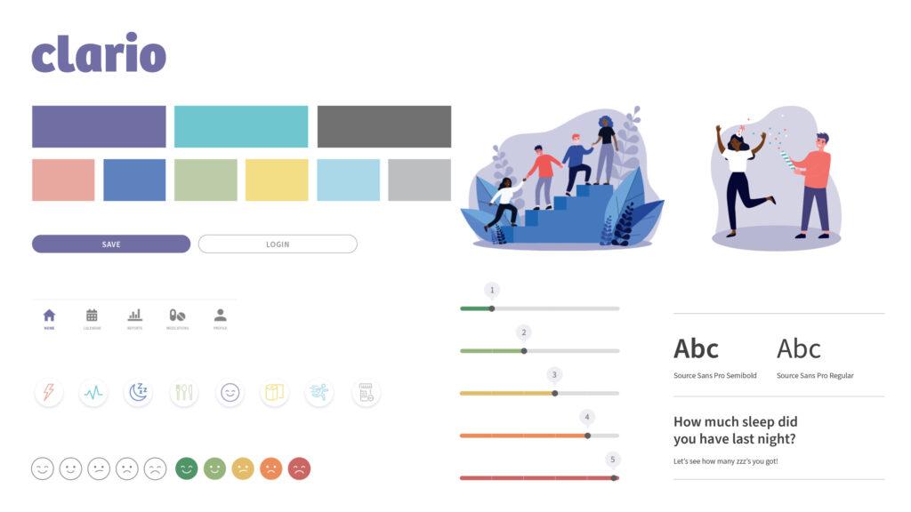
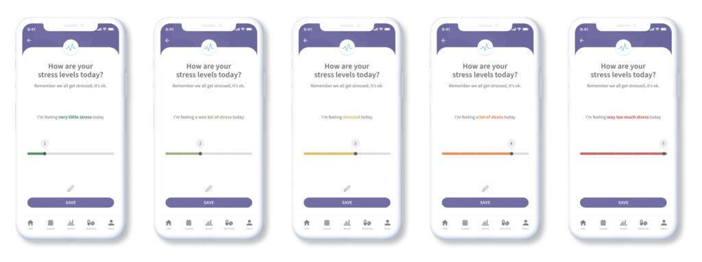
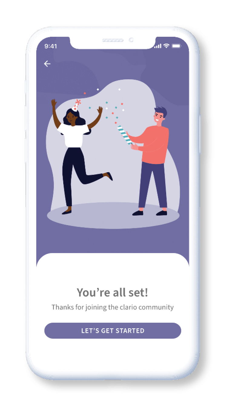
Accessibility is an integral part of any project, to make Clario inclusive and accessible, illustrations were customised to represent multiple ethnicities and genders. Brand colours were selected to be approachable and friendly; but also accessible. With colours meeting WCAG AA and in some cases AAA ratings relating to colour contrast.
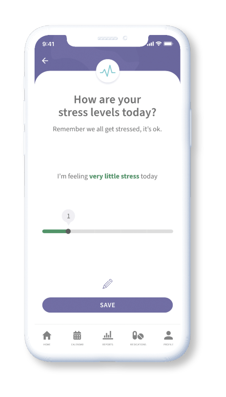
Key functions were approached thoughtfully. For example: sliders use multiple indicators aside from colour that goes from green (good) to red (bad). Each colour stop is paired with a number from 1-5 and is further reinforced with the descriptive copy above which is made bold and corresponds to the colour of the slider.
Summary + Next Steps
Clario is an all-in-one app that provides people with IBD easy-to-use tracking and reporting features. By keeping the user in mind throughout the process, Clario achieves its aims by; enabling people to use insights to find ways to better manage their condition and improve their wellbeing, alleviate some of the stress and overwhelm that can come with managing a chronic illness and helps people feel more in control and empowered to manage their IBD.
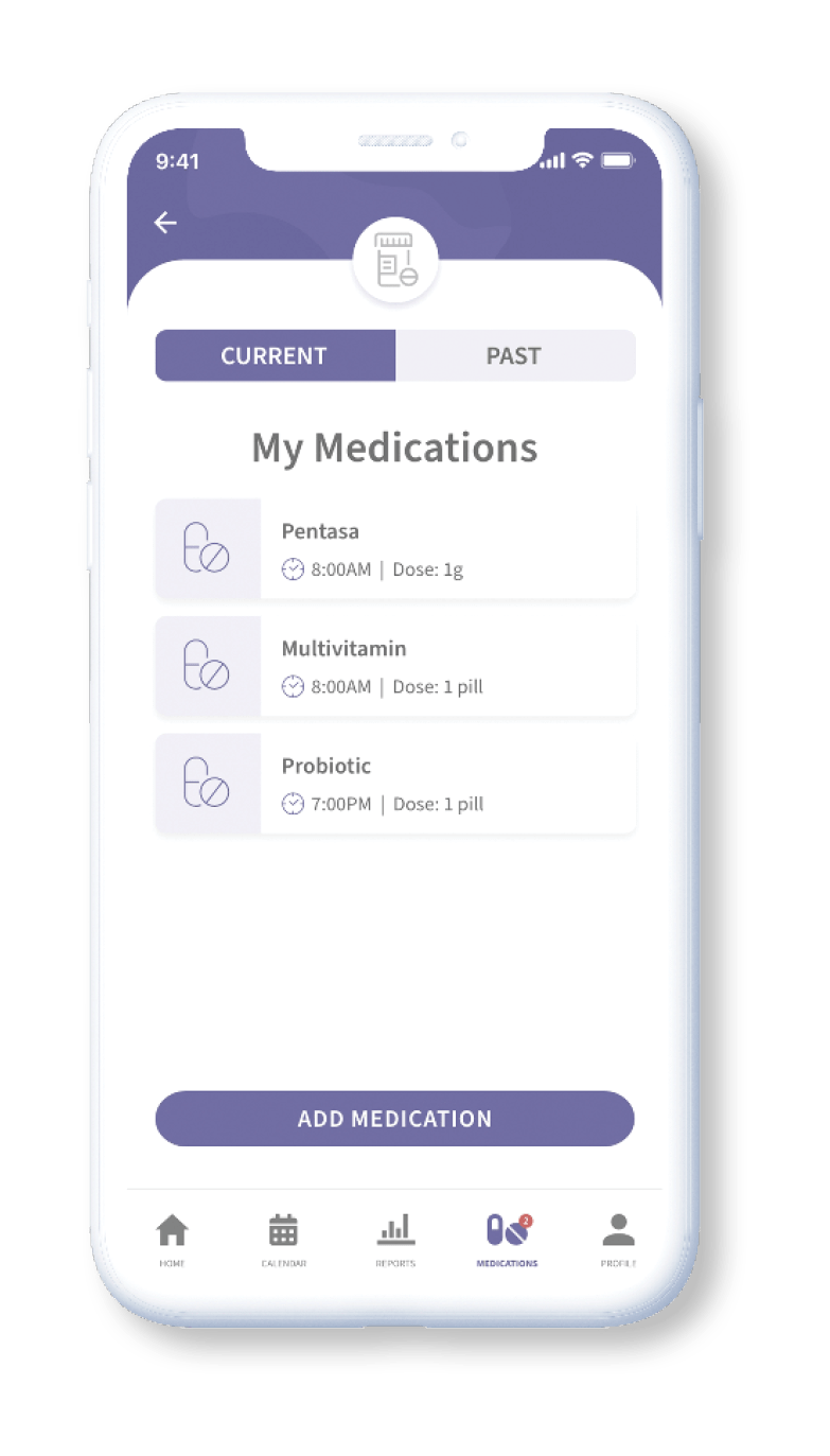
The next steps required to advance app development are to; build additional core functionality and features for the reporting and medication tracking sections as well as conduct more usability testing with a wider test group to provide insights to improve the app further.
