Dimpleskins Naturals was created by a new mother who couldn’t find any effective natural balms or salves for her first child. She took matters into her own hands and launched a line of handcrafted baby care products in 2001. Her award-winning products are now available across Canada.
Goal
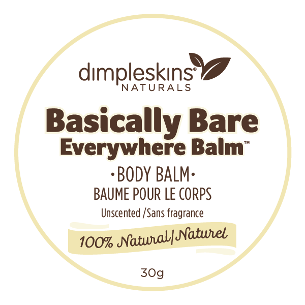
The client wanted to refresh the Dimpleskins Naturals brand when she realised that some competitors were copying her packaging and her products no longer stood out.
Solution
The Dimpleskins Naturals logo was redesigned, making it feel more modern and stand out from competitors. The colour palette for the product line was also updated without undermining the brand recognition already established.
During the project budget and manufacturing were kept in mind to ensure the final design could be implemented with ease. The result is a family of labels that have helped elevate the brand and work well on their own or together as a whole.