Options for Sexual Health
Bringing brand values to the forefront
- Client: Options for Sexual Health
- Role: Project Lead + Graphic Designer
- Duration: 12 weeks
- Design Toolkit
Client
Options for Sexual Health (OFSH) is a non-profit based in British Columbia that provides sexual health services through clinics, educational programs and Sex Sense their free confidential sexual health call in service.
Goal
OFSH felt their branding didn’t accurately represent their values. They wanted a brand that better expressed what their organisation stands for.

Solution
OFSH wanted their community to be heard and involved throughout the rebranding process. So, the project was kicked off by surveying the OFSH community: of employees, healthcare professionals and clients that visit their clinics. This survey helped to build a clear picture of how key groups perceived the organisation.
Keywords used to describe OFSH across all test groups were: approachable, informative, knowledgeable and supportive. 95% of OFSH employees stated informative was the top adjective to describe the organisation, with 89% of clients choosing the same with approachable being second most common descriptor chosen.
This highlighted that how OFSH communicates is essential to their success. It’s a strength that enables them to effectively provide services to clients and maintain strong relationships with healthcare professionals.
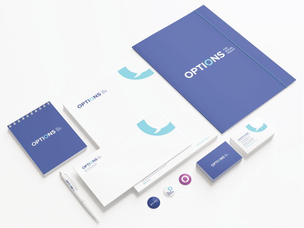
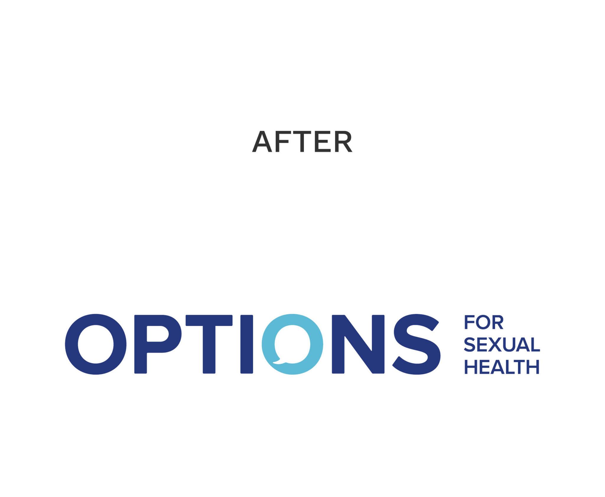
This communication concept was fundamental when re-imagining a new logo, which uses a speech bubble to form the “O” in the word Options. This speech bubble icon was also used as a key visual indicator for the brand.
The redesign was successfully implemented and received. Clients and employees felt it was representative of OFSH’s core values of being knowledgeable, engaging and inclusive.

