


Coastline Change Dashboard
A clearer view of changing Pacific coastlines
I delivered a coastline change dashboard that turns previously unavailable erosion data into evidence decision-makers can act on. Coastlines across the Pacific are eroding and growing at rates that threaten infrastructure and communities, and decision-makers had no way to know where the impact was greatest. I ran project management alongside design on this six-month contract for Digital Earth Pacific and The Pacific Community (SPC), leading a three-person team from research through implementation and handoff.
Problem
I had to simplify complex geospatial information so it was understood at all technical levels, from ministry officials and policymakers to SPC team members, researchers, and scientists. Decision-makers lacked the detailed, location-specific data needed to know where to focus resources or justify investment with clear evidence.
Approach
I set project requirements, using AI to quickly summarize dense documentation and survey findings, and combined that with stakeholder discussions to shape the final scope. From there, I prioritized user needs, giving decision-makers the specific data to act on, over requests that didn't serve that goal. Instead of dropping those deprioritized requests, I consolidated them into a future-phase roadmap for the client.
Throughout execution, Figma's MCP integration let me run quick AI design reviews, a useful check I relied on regularly. A custom AI skill also kept bug and feature tickets in GitHub clear and consistent, keeping quality and momentum high across the team.
Solution
I designed a dashboard that turns coastline data into numbers people can act on. Users select a Pacific nation and immediately see coastline hotspots color-coded by rate of change, with statistics that update live as they interact with the map.
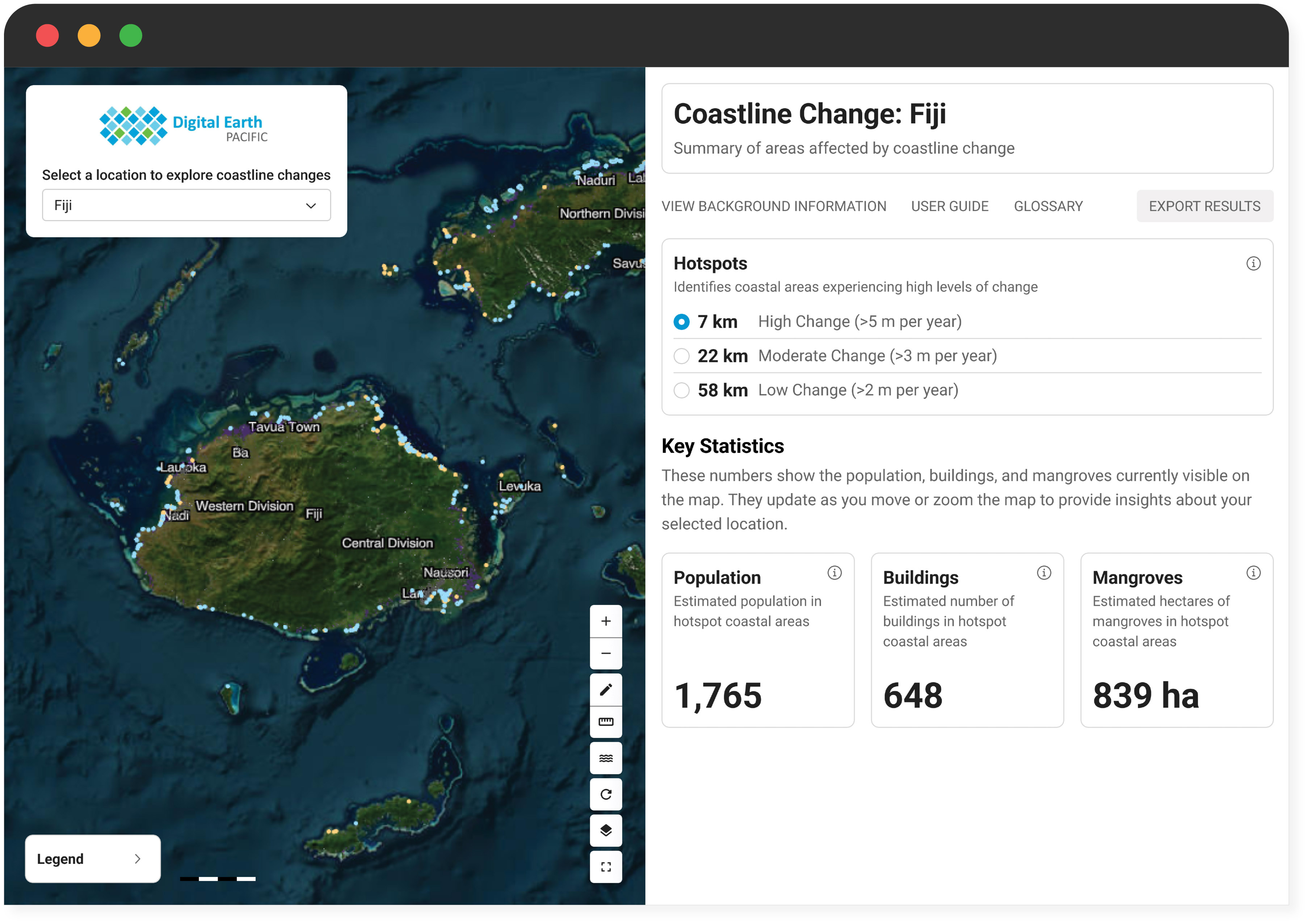
The core feature is a statistics panel that converts data into plain-language figures for individuals to cite directly rather than derive on their own, like the estimated 1,765 people, 648 buildings, and 839 hectares of mangroves in Fiji's hotspots of highest change. These figures can also be exported as an image for funding reports. The map also flags lower-confidence data with a dashed line rather than treating everything as equally certain. A fullscreen view with a fully responsive layout means it works the same at a desk or in the field.
Impact
I gave the people making decisions about these coastlines something they never had, clear estimates of how many people, buildings, and mangroves were at risk. The client has run the dashboard independently since launch, as is standard once a consultancy engagement wraps. Carrying project management alongside design here gave me a clear sense that design is where my strengths are best applied, insight that's shaped how I approach every project since.