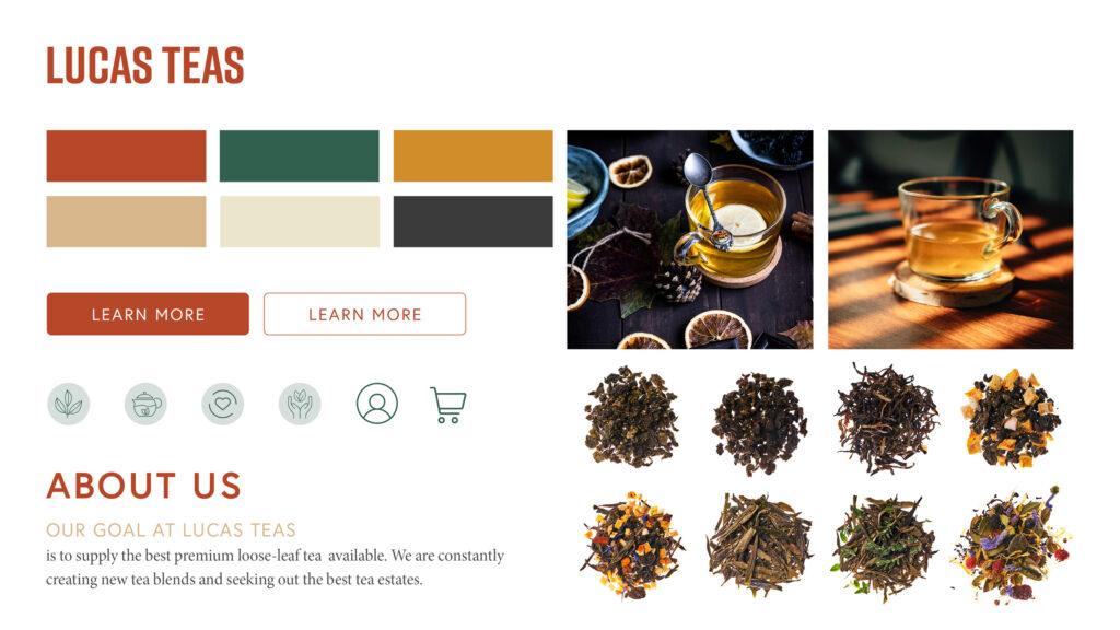
Lucas Teas
Helping a small business discover their voice
- Project: Website Redesign Student Project
- Roles: UX Researcher/Designer, UI Designer
- Duration: 5 weeks
- Design Toolkit
About
Lucas Teas is a small family-owned business in Squamish, BC that prides itself on providing customers with the best loose-leaf teas. They curate a collection of premium teas that are ethically sourced, naturally flavoured and free of pesticides.
This project aimed to help improve Lucas Teas' market position by enhancing the functionality and visual design of their website.
Discover
Introduction
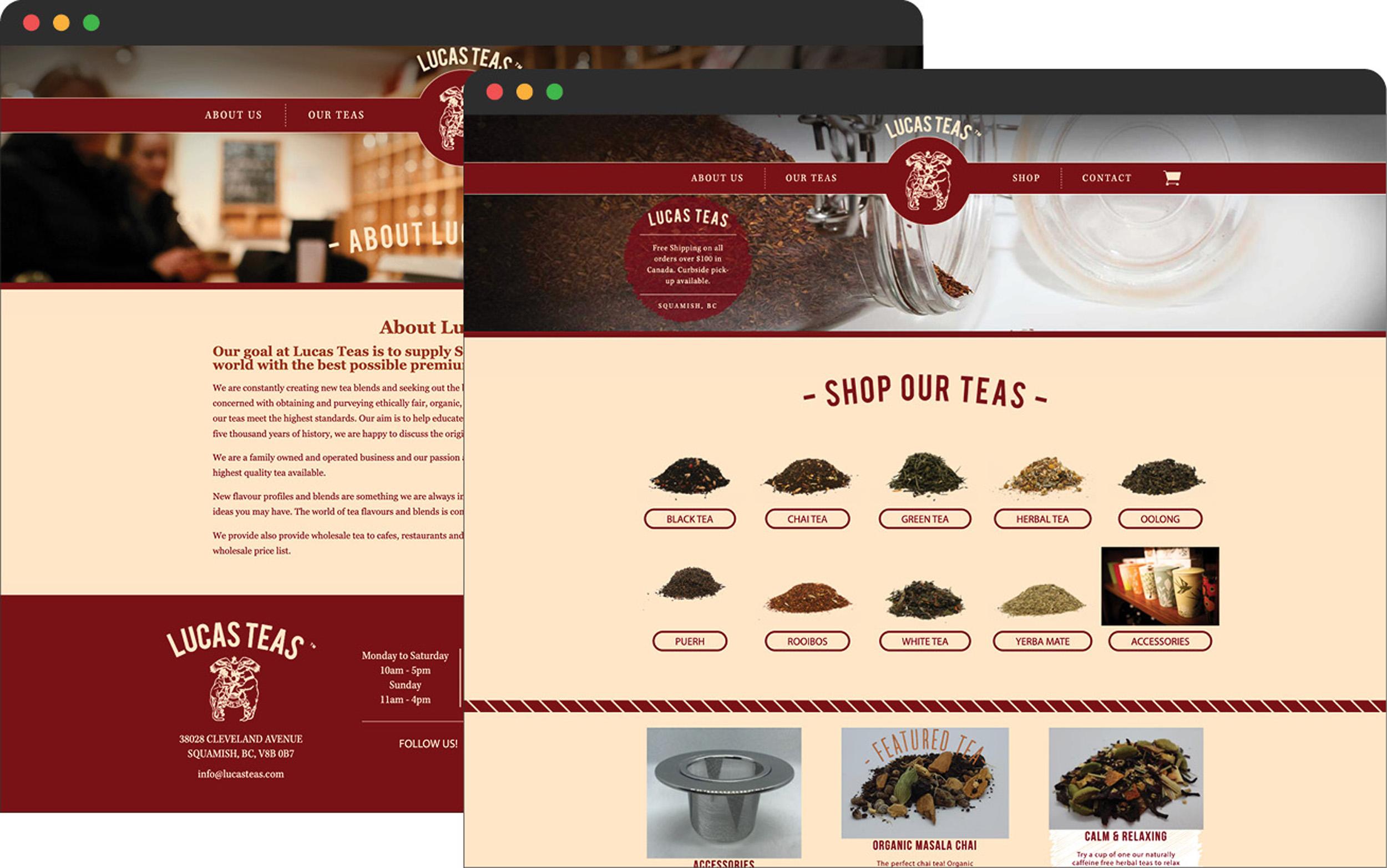
Lucas Teas has some of the best teas you can find and an incredibly knowledgeable team. However their website doesn’t reflect this expertise and feels disjointed from their high quality products. This project explores how they are currently marketing themselves and how it can be improved.
Site Audit + Review
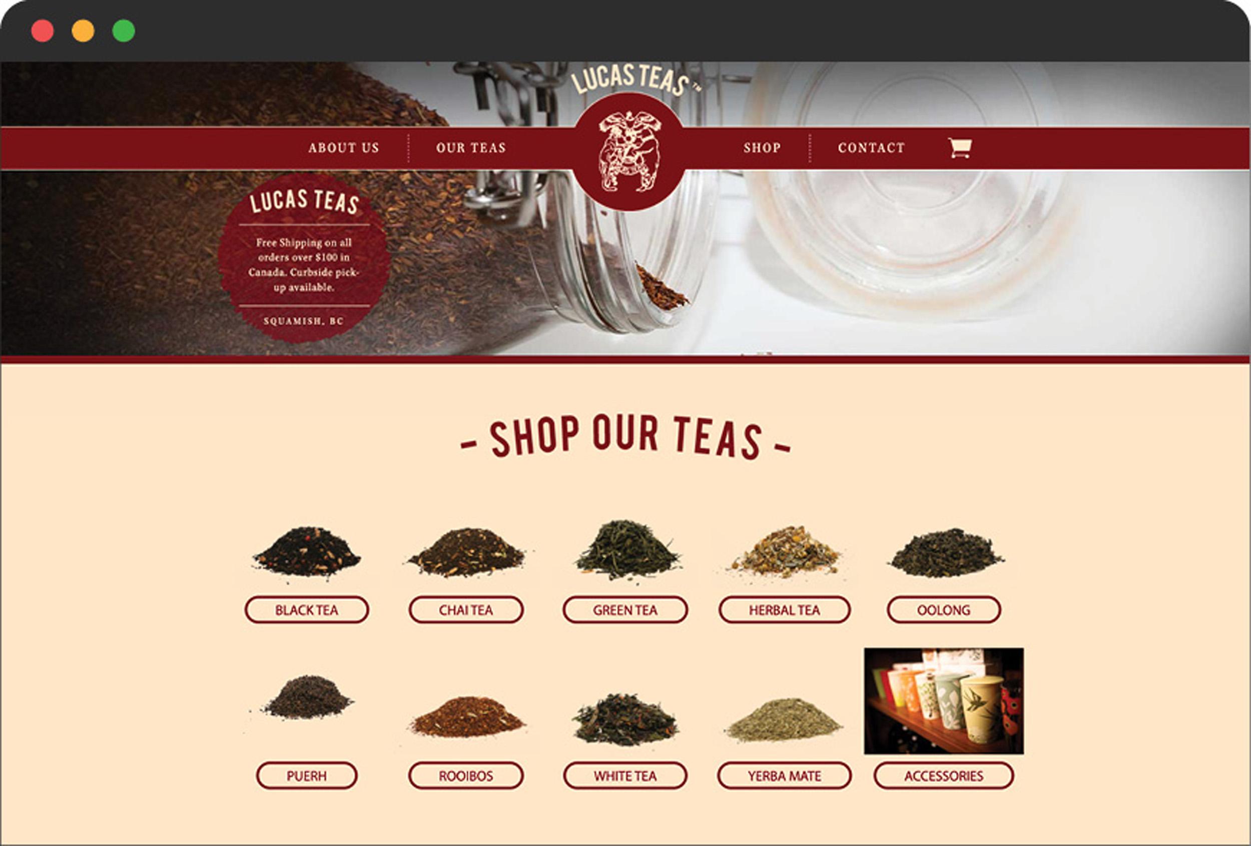
After a review of their current website, three key areas for improvement were identified:
- Inconsistent user experience and visual design
- Hard to shop and purchase teas
- Missing information of their extensive tea knowledge
Collecting Insights on Market Position
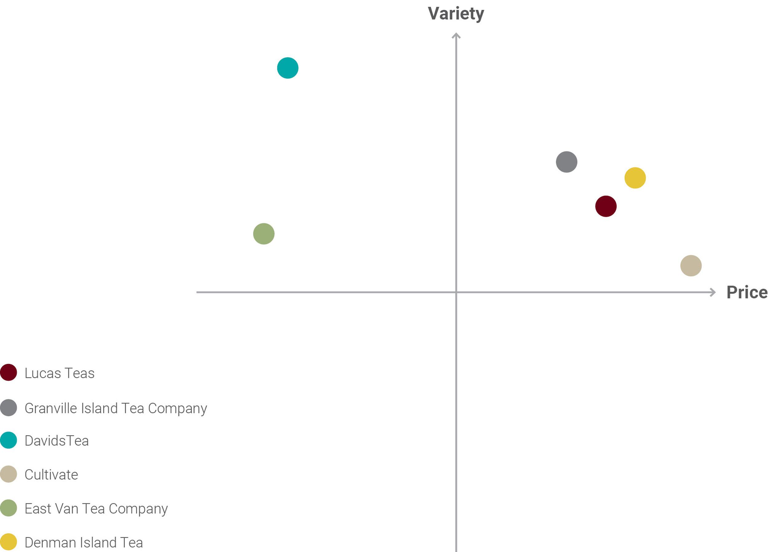
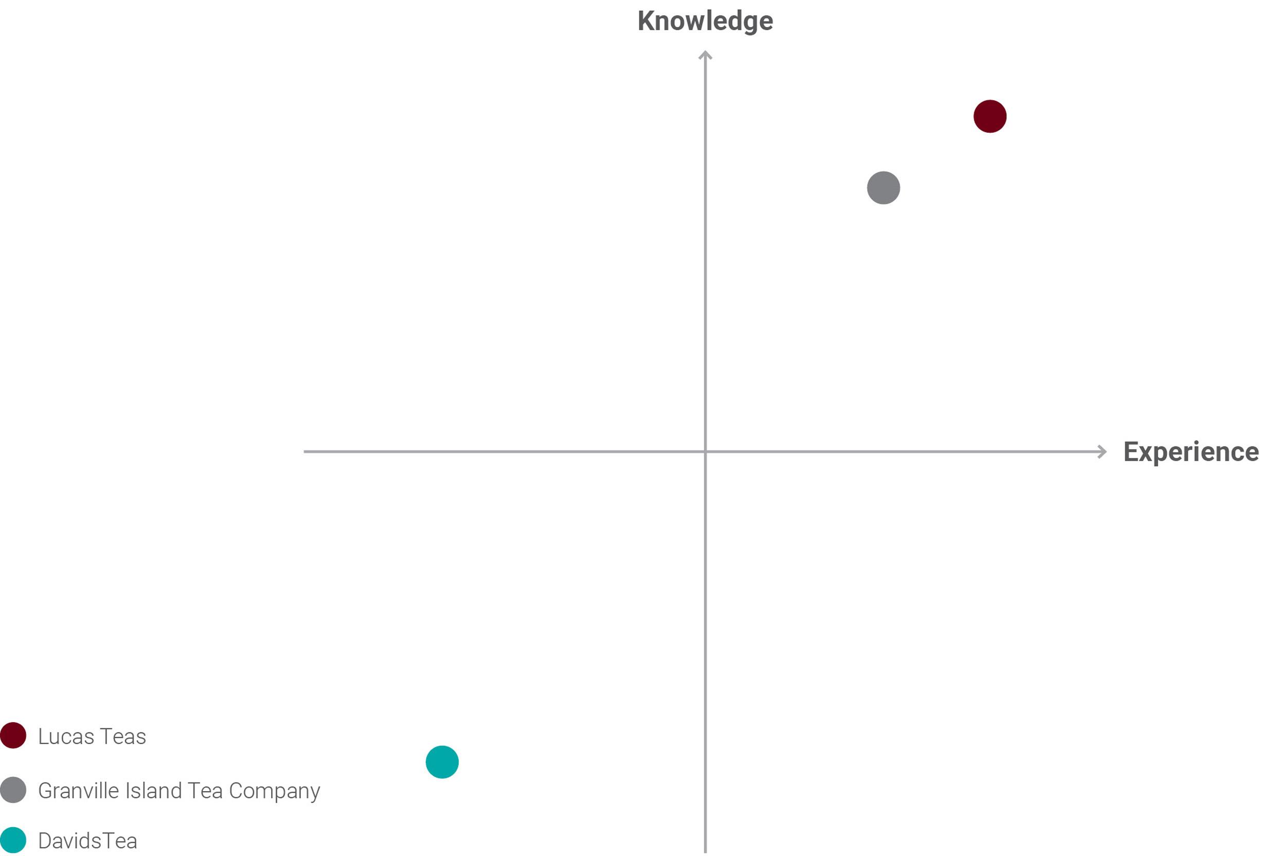
A competitor analysis was carried out to gain insights on product variety, pricing, knowledge and overall customer experience.
Variety + Price Comparison
Findings: When compared to competitors Lucas Teas offers less selection than most, and lands at a higher price point.
Knowledge + Experience Comparison
Findings: Comparatively Lucas Teas has a high level of knowledge and ranks high in the overall experience when shopping in-store.
SWOT Analysis
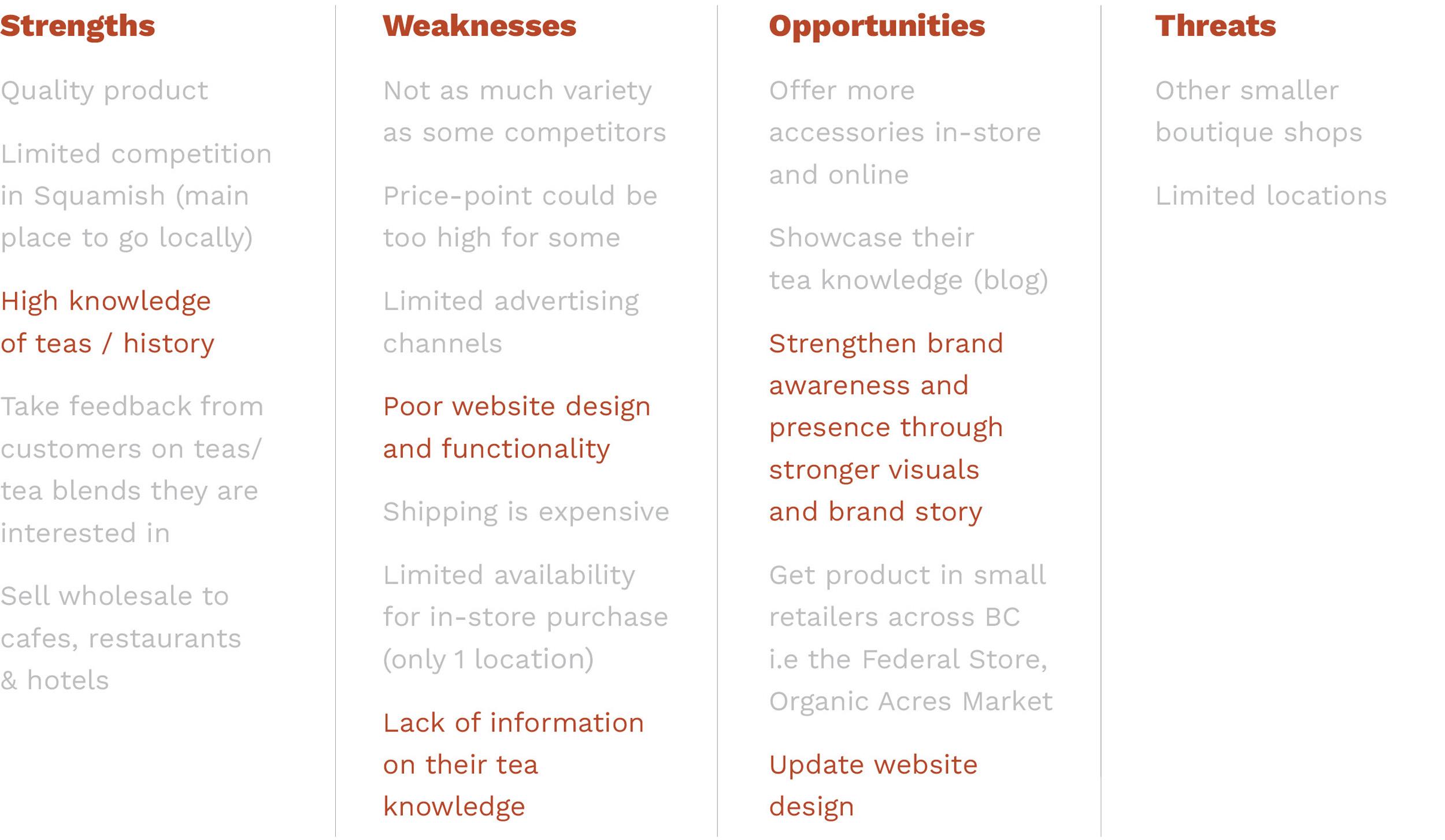
A SWOT analysis was conducted to pinpoint key improvement opportunities.
DEFINE
Key Insights + Findings
Research insights highlighted that the website redesign needed to:
- Improve visual and UX design
- Prominently showcase their teas and improve the shopping experience
- Tell the brand story
- Showcase their tea expertise
Problem Statement
“How might we improve the Lucas Teas website to create an effective marketing tool to help gain more business?”
Goals + Opportunities
Information Architecture
Easy to find information is key.
IA can be improved by restructuring site content to help highlight core information and elevate the brand, adding a blog page to showcase their tea expertise and enabling returning customers to login to their account via main navigation.
User Experience
A seamless experience is crucial.
A number of UX issues make it hard to purchase tea. For example: broken links and accessibility issues caused by illegible text. This creates unnecessary friction for potential customers and diminishes trust in the brand.
Visual Design
First impressions matter.
The current site looks outdated due to the red and beige colour palette and inconsistent use of type, images and graphic elements. This adds up to a site that feels unprofessional and doesn’t entice new customers to explore or make a purchase.
DEVELOP
Wireframes
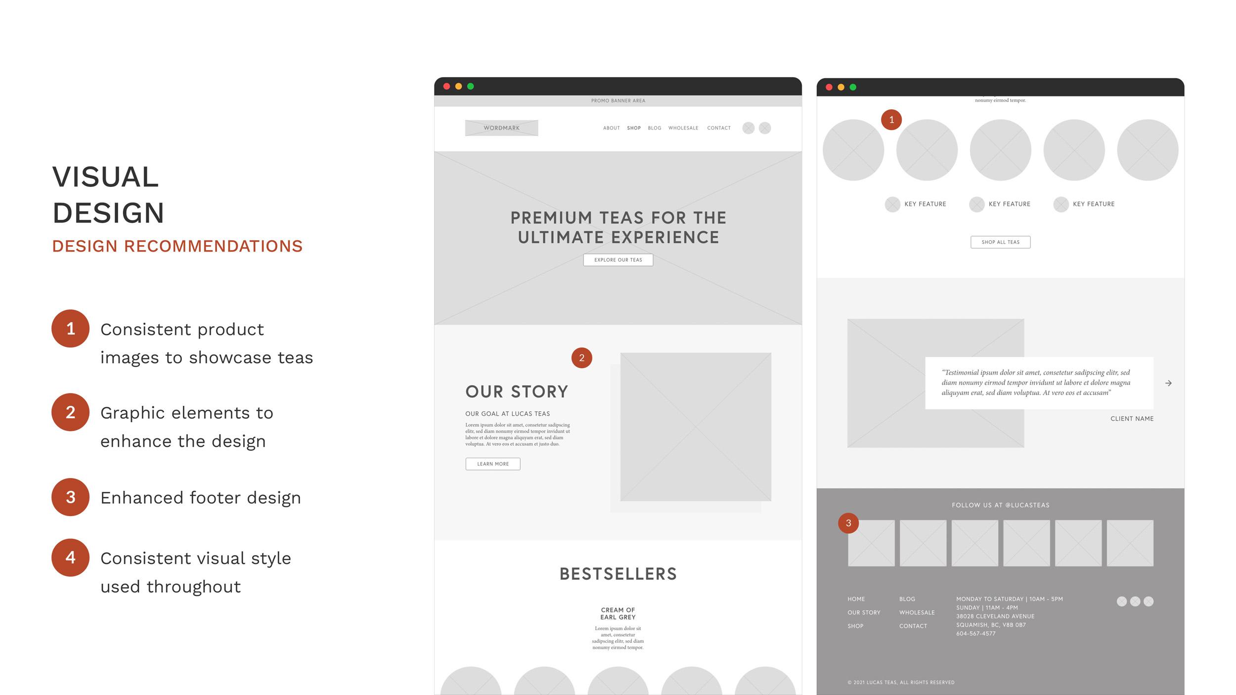
With the research completed and design opportunities identified, it was time to start mapping out an improved site structure. Low fidelity wireframes were created that focus on the core opportunities: improved information architecture, user experience and visual design.


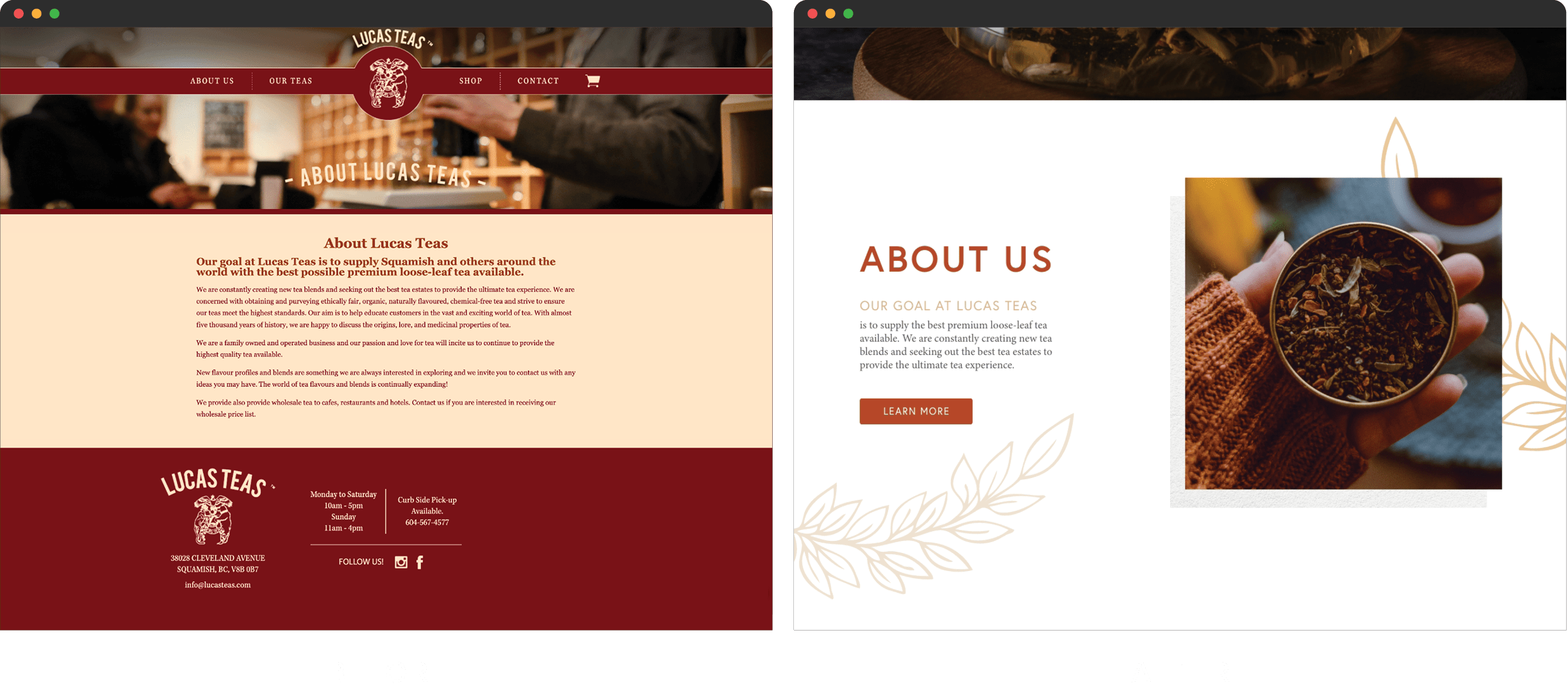
Final Solution: Before + Afters
Information Architecture: Restructured to bring core and missing content to the forefront.

User Experience: Streamlined product page with filters and quick view on hover to help customers quickly find what they are looking for.

Visual Design: Updated to get tea lovers excited about the brand and their products.
High Fidelity Walkthrough
Next Steps + Key Takeaways
In contrast to the current site the proposed site redesign creates a better overall customer experience with improved UX and visual design, ultimately creating more credibility and brand value. Additionally, the overhaul of the product page and enhanced filtering and search capabilities could benefit the company by boosting sales.
If this were a real world project, the next steps would be to build user flows, do usability testing and iterations to further refine the design and build out mobile applications.
